What’s in a Name v2.0
You’re not going to believe this! Although knowing me you probably are.
As it turns out, naming things is even more complicated than I thought. When I set out to name this website, I embarked on a journey to the farthest reaches of my mind. I scaled the tallest mountains and weathered the harshest... well, weather.
Well, not exactly, but before we continue, it would be helpful if you read my original What's in a Name post from February. It'll give you the context you need for what follows.
Let's start with the main question you may have: What was wrong with [REDACTED]? The answer is, nothing really, I still like it. I still stand by the process I went through to get to the name. The thing is, with anything like this, you have to live with it for a while before you really get to feel how it fits. And honestly, after living with it for the last few months, it just didn't feel right. Saying the name out loud wasn't as natural as it had been during my practice runs (yes, I did spend way too much time saying it out loud to see how it felt). I think the biggest issue was that I had to spell it out for everyone every time I mentioned it.
All this, of course, felt like a letdown. I felt my process had failed me.
After moping around for a few days and playing with the idea of changing the name, I decided it was the right thing to do. I would never be happy otherwise. The situation had gotten so bad that I found myself actively avoiding work on the website because I couldn't see it lasting. The name had started to sour the whole thing. Isn't it strange how something I was once so passionate about could become such an issue?
I soon realised there was a another issue. I wanted a logo. I knew this all along but had trouble coming up with ideas. This is when I realised my mistake could become an opportunity.
I started with what I consider the reverse approach. I fired up ChatGPT. I know, I know, lots of people hate AI. If you're part of that camp, I get it, I do. I find it to be a great tool to jumpstart my thinking and get ideas flowing. My AI-powered friend asked me a bunch of questions, and together we discovered that I wanted a simple, recognisable symbol that already exists. Something people would instantly know, but with my own unique twist.
It didn’t take long to find out my favourite of all the symbols is the ampersand. Together we developed what would be the first version of the site logo.
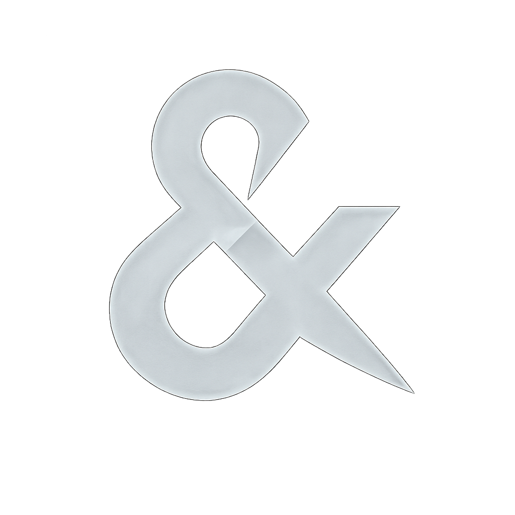
Here it is:
The Original
Overall, I liked the basic shape. It's clearly an ampersand but just different enough to be my own. I needed it to have a specific look that would fit with my website's design because there's no way I'm going to redesign that, unless... NO, I can't do that!
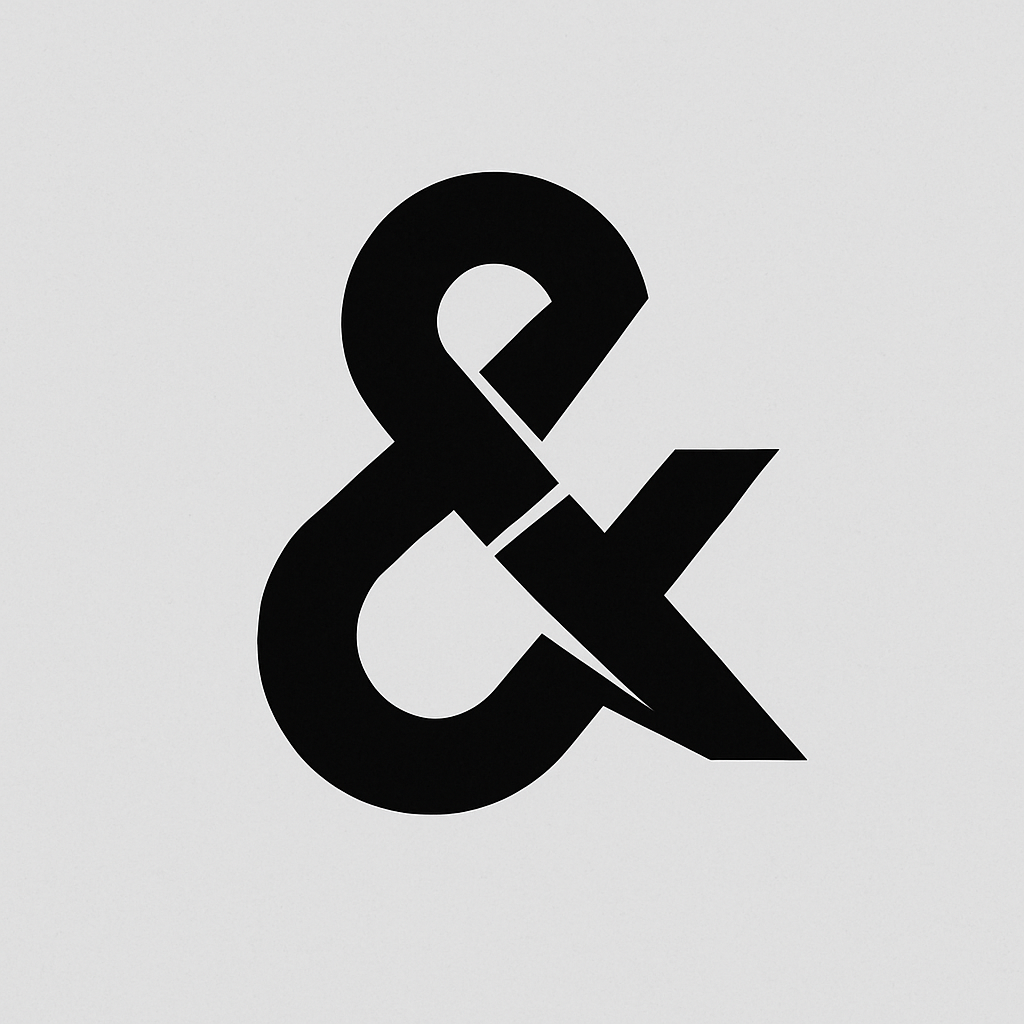
After some experimentation, I decided to try out a frosted glass look. Here's what I created:

The Frosted Glass Look
I fell in love with this one. While it's clearly an ampersand, it has just enough uniqueness to make it special.
I had a logo, but I still needed a name. Working backwards proved challenging since everything had to fit with the logo. All the cool names were either taken or the domains were way beyond my budget. I even considered andandand.media at one point, but saying it aloud made me sound like a malfunctioning robot.
I pondered it for days, waiting for inspiration to strike. I knew I wanted a common phrase, something that would make people think "Ah, that's clever!" I spent weeks searching for domain names as ideas popped into my head. The site almost became "beans on toast" or "big light on," but neither felt quite right. Plus, they would've meant starting the whole logo adventure all over again.
I went through the whole logo fiasco again (ha!). I wondered if maybe the ampersand wasn't the right symbol after all, so I moved on to the != symbol. It's one of my favorites, it means "does not equal" or "not equal to," and almost any variation of that phrase works. Following the same naming process, I discovered that doesntequal.com was available. Well, it's no longer available because I now own it. I liked the idea of calling the site "Doesn't Equal," though something in the back of my mind told me it wasn't quite perfect.
Then another problem reared its head. As much as I liked the logo, it just didn't look as good as an ampersand. Take a look:


As you can see, I tried a few different looks. Don't get me wrong, it looks nice, but it just seemed out of place on the page.
I had given up at this point, I decided to stick with [REDACTED] and just make it work.
Almost a full week had passed whan I had an epiphany, in the place that all the best epiphanies happen, the loo.
I was updating my apps (as you do) and noticed an update for an app that I wanted to check for new features. When I tapped it, it said "Bug Fixes and Improvements," and I thought, "Someone should make a website called Bug Fixes and Improvements, it'd be quite clever!"
My eyes widened. I stood up, then immediately sat back down. After composing myself, I left the bathroom and ran to my computer—completely forgetting the phone in my hand—and typed in bugfixesandimprovements.com. Nothing happened. How was this domain not already active? I rushed to my domain registrar and typed in bugfixesandimprovements.com. Not only was it available, but it was well within my price range! I bought it immediately, checking and rechecking the spelling, convinced I had made a mistake.
It was mine.
I sat with the name for a few days, feeling it out, sounding it out. Everything fit perfectly. Yes, the phrase is commonly used in tech, but it seamlessly applies to life and creativity too. It resonated with me, the more I thought about it, the clearer it became that life itself is just a series of bug fixes and improvements. The ampersand plays a crucial role because it emphasizes that bug fixes aren't the whole story, it's the improvements that motivate us and propel us forward. I knew I had found it.
All I had to do was work out how I wanted to display the logo and title. That actually came quite easily. I'm sure if you've made it to this point, you've seen the logo on the front page (if not, you can go back and have a look soon—there's not long left now). I made a few different colours and styles of the logo to try them out, and that's when it hit me: I could make a logo for almost every occasion.
As I write this, I've created 69 distinct logos—and there will be more. I'll be using them all in different places throughout the year. Currently, my ampersand is wearing their Tuxedo to celebrate the launch re-launch. In case you missed it, here it is:

All Dressed Up
I've created many designs that I'm proud of and will showcase throughout the year and beyond, you'll need to check back regularly to see them all. For now, let me show you the seasonal designs. My absolute favorite is the autumn one.


Thank you for reading another post on naming things.